Enhancing Online Registration for Special Olympics Canada

About Special Olympics Canada

About Special Olympics Canada

Special Olympics Canada (SOC) is a national organization that fosters self-esteem and interpersonal skills in individuals with intellectual disabilities through year-round competitions.

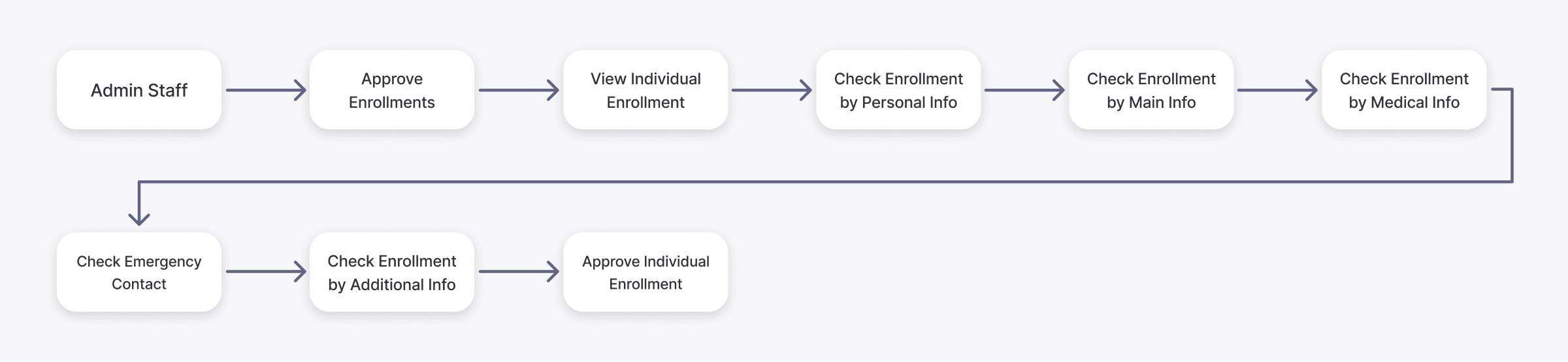
I worked with SOC to improve their Online Registration Portal, aiming to simplify the process for the Athlete Registrants and the Admin Staff processing their enrollments.

Application: Web App

Project Duration: 2023

Team: Product Owner, Business Analyst, Registration SMEs, UX/UI Designer (me), Full Stack Developers

Final Deliverables: High Fidelity Designs, User Research, Component Libraries

Objectives for the Registration Portal

Objectives for the Registration Portal

Project success for the portal update was guided by the following goals

Project success for the portal update was guided by the following goals

Project success for the portal update was guided by the following goals

  1. Update the online registration process to enhance overall user experience

  1. Update the online registration process to enhance overall user experience

  1. Optimize and streamline the approval process for administrative staff to improve efficiency

  1. Optimize and streamline the approval process for administrative staff to improve efficiency

  1. Enhance the registration process to accommodate requirements for all SO Chapters

  1. Enhance the registration process to accommodate requirements for all SO Chapters

Project Outcomes

-50%

Loading Time

85%

Positive Feedback

2 Chapters

Influenced to Adopt

Understanding the Problem

Understanding the Problem

Registrant Process

Registrant Process

My team conducted interviews with 10 users, including both administrative staff and volunteer registrants. The Athlete user process goes through multiple different information sections before the application can be submitted.

My team conducted interviews with 10 users, including both administrative staff and volunteer registrants.

The Athlete user process goes through multiple different information sections before the application can be submitted.

Admin Staff Approvals

Admin Staff Approvals

Admin staff navigated to a new pop-up window for each section before they could ultimately confirm and validate registration for the Athlete registrants. This became challenging at a larger scale, once the volume of registrants increased.

Admin staff navigated to a new pop-up window for each section before they could ultimately confirm and validate registration for the Athlete registrants.

This became challenging at a larger scale, once the volume of registrants increased.

Insights & Findings

Insights & Findings

Creating a Minimum Viable Product

Creating a Minimum Viable Product

Each Special Olympics Canada provincial Chapter used different registration portals and forms. To build a universal online portal, we needed to establish a minimum standard that everyone could agree on. A Minimum Viable Record (MVR) was created by documenting, listing, and comparing the unique needs of each chapter.

Each Special Olympics Canada provincial Chapter used different registration portals and forms.

To build a universal online portal, we needed to establish a minimum standard that everyone could agree on.

We started by creating a Minimum Viable Record (MVR) by documenting, listing, and comparing the unique needs of each chapter.

Cramped Design

Cramped Design

Our MVR revealed several outdated registration fields and elements that made the layout feel cluttered and disrupted the user flow. By removing these unnecessary fields and updating the layout for better readability, we can create a more streamlined form that improves both usability and the overall user experience.

Our MVR revealed several outdated registration fields and elements that made the layout feel cluttered and disrupted the user flow.

By removing these unnecessary fields and updating the layout for better readability, we can create a more streamlined form that improves both usability and the overall user experience.

Validation Frustrations

Validation Frustrations

"As an admin, I struggled with registering large numbers of participants. It became tedious to open new windows for each registration section for every athlete."

"The admin interface was hard to use - common actions like Approving Enrollments were buried under many levels of menus and flows."

"Participants found the current portal too complex, so they resorted to registering via pen and paper—which ended up being even more taxing for us on the admin staff."

Interviews with admin staff highlighted frustration with the registration validation process. Currently, admins must scroll through a lengthy, single-page form, making it difficult to manage thousands of registrants. They also noted the inconvenience of having to start from scratch if a window is accidentally closed.

Interviews with admin staff highlighted frustration with the registration validation process.

Currently, admins must scroll through a lengthy, single-page form, making it difficult to manage thousands of registrants.

They also noted the inconvenience of having to start from scratch if a window is accidentally closed.

Project Outcomes

Project Outcomes

Connecting with Chapters

Connecting with Chapters

The MVR process allowed us the opportunity to check in with each Chapter and understand their unique needs. This collaborative effort also helped Chapters gain more participation and empowered them in the design process, fostering cooperation and understanding in the future.

The MVR process allowed us the opportunity to check in with each Chapter and understand their unique needs.

This collaborative effort also helped Chapters gain more participation and empowered them in the design process, fostering cooperation and understanding in the future.

Improving and Simplifying Layout

Improving and Simplifying Layout

After finalizing the MVR, we successfully reduced the number of fields by 40%, allowing for greater flexibility in restructuring the registration form. We organized the remaining fields into distinct sections, enhancing both readability and scannability for users.

After finalizing the MVR, we successfully reduced the number of fields by 40%, allowing for greater flexibility in restructuring the registration form.

We organized the remaining fields into distinct sections, enhancing both readability and scannability for users.

Enhancing Enrollment Layout

To address the challenges faced by admin staff, we added sticky navigation to the layout. This allows them to easily switch between sections of the form, which reduces the cognitive load of having to focus on a long, single-page document. This improvement streamlines their workflow, making the process of approving enrollments more efficient.

Enhancing Enrollment Layout

To address the challenges faced by admin staff, we added sticky navigation to the layout. This allows them to easily switch between sections of the form, which reduces the cognitive load of having to focus on a long, single-page document.

This improvement streamlines their workflow, making the process of approving enrollments more efficient.

Takeaways

Takeaways

Working with Limited Resources

Working with Limited Resources

It was difficult to change the portal's existing framework, so we worked on creating 'quick wins' and visual updates that could improve the user experience without changing too much code.

Establishing a design culture

Establishing a design culture

As the first UX Designer, I created a culture that prioritized user interviews and feedback in the discovery process. In keeping it a collaborative process, our users felt a sense of empowerment and ownership

Pitching design decisions to non-technical users

Pitching design decisions to non-technical users

I learned to pitch and defend my design decisions to stakeholders, keeping in mind the unique business needs with each provincial chapter  

Nathan Chan © 2025

Nathan Chan © 2025

Nathan Chan © 2025